3 minutes to read
Five steps towards a web for everyone
Web accessibility is an increasingly important topic. Five practical, WCAG-aligned tips that improve inclusion — and also boost SEO and revenue.

Understanding web accessibility
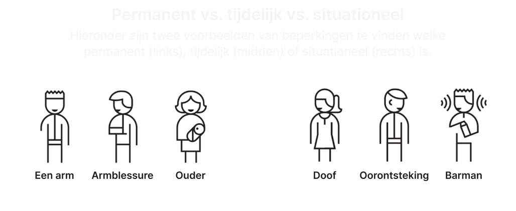
Web accessibility means everyone can use the web, regardless of permanent, temporary, or situational limitations. A smartphone in bright sunlight represents a situational limitation—the screen becomes unreadable, making content inaccessible in that moment.
In the Netherlands, between 2,000,000 and 4,500,000 people experience some form of permanent disability:
- 500,000 with visual impairments
- 500,000 with auditory impairments
- 1,100,000 with intellectual disabilities
- 1,600,000 with physical disabilities
- 800,000 with dyslexia
- 1,500,000 with low literacy
“Web accessibility is essential for many visitors and beneficial for everyone.”
The business case for accessibility
Accessible websites generate more revenue in two ways. First, people with disabilities can make purchases on accessible sites, capturing revenue otherwise lost. Second, search engines rank accessible websites higher because they can more easily index pages with good structure, descriptions, alternative text for images, and improved readability. Better search rankings attract more users and increase income.
Top 5 easy wins
Following the WCAG (Web Content Accessibility Guidelines), these five practical tips significantly improve accessibility:
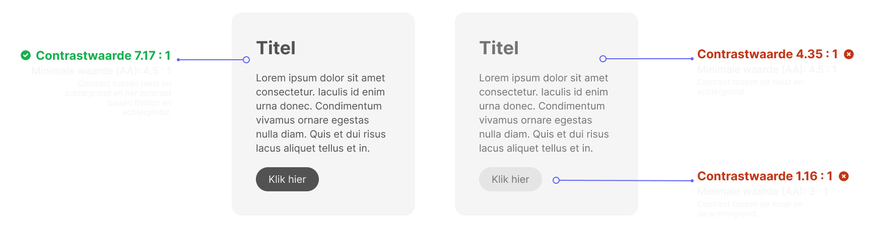
1. Use sufficient contrast
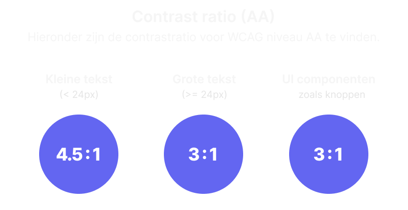
Contrast allows viewers to identify elements as separate entities. This applies to text and interactive elements like buttons. Contrast is measurable using tools like WebAIM’s contrast checker, expressed as a ratio. WCAG specifies different minimum values depending on element type and compliance level.
For text, the minimum contrast ratio at WCAG Level AA is 4.5:1 for normal text and 3:1 for large text. UI components require 3:1 contrast. Exceptions include logos, decorative elements, and inactive elements—though inactive buttons should still be legible to communicate their unavailable state.
Designer judgment matters: always test designs with actual users rather than relying solely on automated checkers.

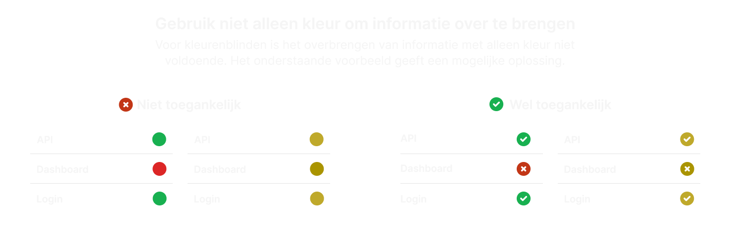
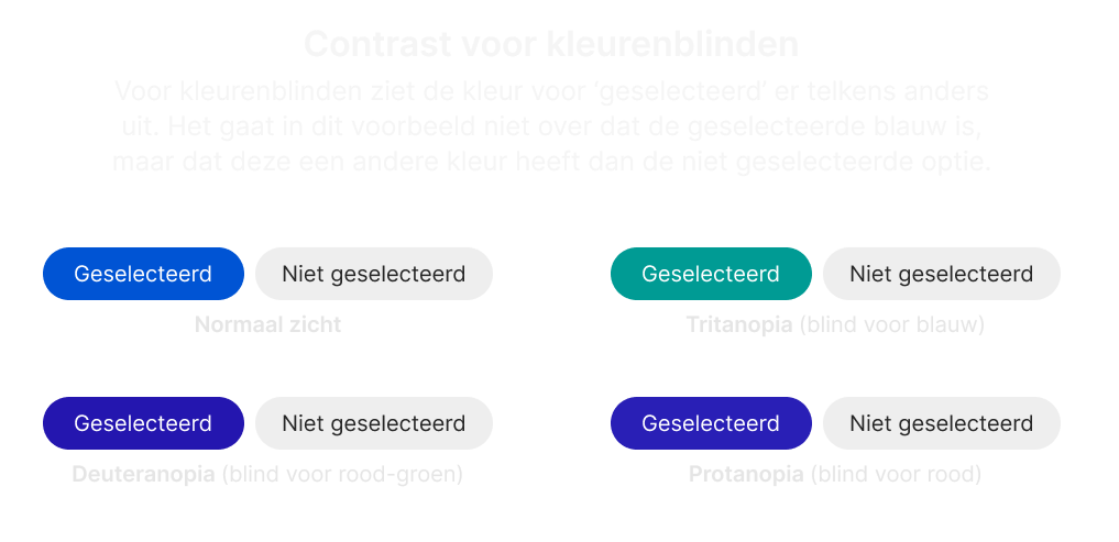
2. Color alone shouldn’t convey information
Color blindness affects 8% of Dutch men and 0.5% of Dutch women. The two most common types are deuteranopia (difficulty perceiving green) and protanopia (difficulty perceiving red).
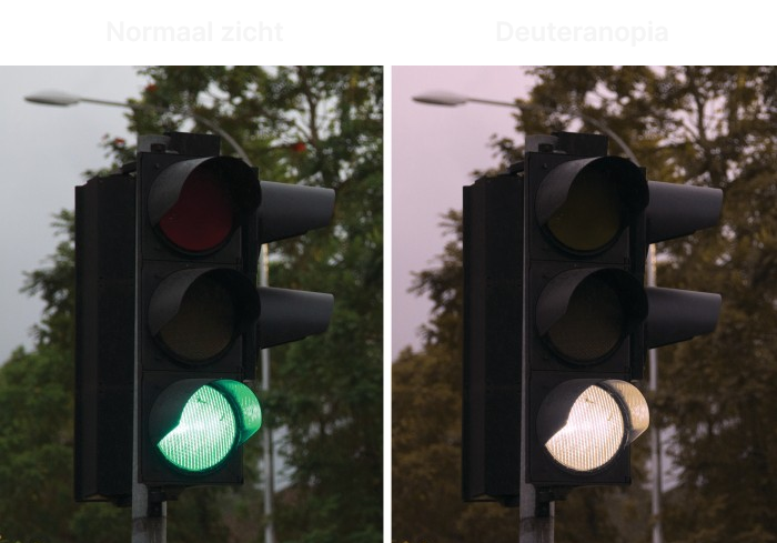
Information conveyed through color value alone risks being misunderstood. Dutch traffic lights demonstrate this principle: they communicate status through both color value (red, orange, green) and light position, allowing color-blind individuals to understand the signal.
Online, status indicators should use icons alongside color changes. When indicating selection through color difference between selected and unselected states, the specific color matters less according to WCAG standards.
3. Use web standards
Accessible design requires using HTML5 semantics and elements correctly. A clickable element triggering action should be a <button> element that looks and behaves like a button. Using elements for their intended purposes avoids adding unnecessary custom logic that often results in overlooked accessibility requirements.
Similarly, during design, buttons should look like buttons with button behavior. Buttons are often misused for navigation—this is the role of hyperlinks. Distinguish between the two during the design phase.
4. Use a logical structure and order
Screen readers scan websites and read content aloud, allowing visually impaired users to create mental models of pages. Screen readers read in the standard reading direction: top left to bottom right, following an F-pattern users naturally use to scan pages.
Maintain this default reading order on your website. Consider providing skip links to let users bypass repetitive elements like main menus.
5. Test with keyboard only
Complete the fifth tip by testing your website using only a keyboard, without a mouse.
Accessibility benefits everyone
Regardless of website type—informational or e-commerce—the goal is attracting as many users as possible. By applying these five tips, you ensure a significant portion of the population can access your website effectively.